

Branding
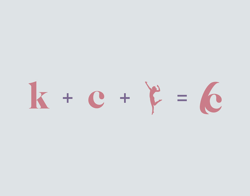
My logo, at first glance, looks like the letter K. This is because my nickname is “Cae,” which phoenetically sounds like the letter. There is also a C incorporated into the K, which is my first initial. I also wanted my logo to have a lot of movement, to represent myself as a person. I am very energetic and I play a lot of sports to release that energy so I decided to include that movement into my logo.
The main colour I use, both in my branding and in my logo, is pink. Pink is a feminine colour, associated with charm and playfulness. I chose this colour because I wanted my branding to look very inviting. My designs also cater more towards women, as I have very feminine designs. I also chose pink because, other than it being my favourite colour, I feel that it represents me, as a person. I am bubbly and friendly just like the colour.
When I was designing my logo, I knew I wanted to include my initials. But I didn’t want to do a basic C. Instead I decided to do a monogram, because there are only so many ways I can play around with two C’s. After many designs and critiquing from my classmates, my logo finally emerged.
Many of my branding items only use my colour and my logo, plus another element. I didn’t want my branding to be restrictive so I decided to just have little things in my merch to be cohesive.